Give A Sock
About the website
Give A Sock delivery service for the homeless population, designed to give momentum to options, while providing socks & valuable resources to access.
Role and Responsibilities
UX/UI Interface & User Research
Software Used
Figma, Miro
Timeline
Four weeks
Year
2021
The problem

Give A Sock is a platform that was build to help homeless population. Many people across the country are willing to donate funds and goods to those needies, because of the unclear contains and information on the website, it’s been almost impossible for volunteers to make donation.
Current give a sock link
Solution
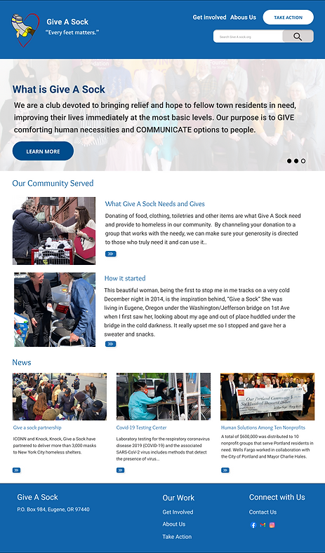
The previous Give A Sock website had some confusion sections. There were many items missing. The website did not contain all UI elements and the choice of the color was not well done. The team and I redesigned the website to make it more accessible and easy to navigate in order to get support from providers so that the communities can be served.
Design Process
03
Ideation
Analysis
02
Analyzed the user’s pain points and started thinking of what are the solutions we can come up with to solve their problems.
Research
01
This phase helped to gather information from our users, get to know who they are and what are their needs.
After captured keys points, the team wrapped up ideas and dived into visual concrete of the website.

Design
The focus after redesigning the website were turned into a question: Is it how the website should look like ?
04
Launch
Finally the website get tested and applied changes based on the user’s feedback.
05
Research
Primary Research
Interviews
-
We conducted four interviews.
Data survey

The results from the survey indicates that 58.8% of people donate more Goods, which is an excellent to contribute to others who need help with, Clothings, Groceries, Households, and Furnitures. 29.4% of people donate funds which help a lot of people afford their life expenses and finally 11.8% are people who have been volunteering in certain activties to help organizations, communities and charities.
Introduction questions
-
Get the deeper understanding about what people think of helping charities.
Task to accomplish
-
Where can you find contact information on the Website

-
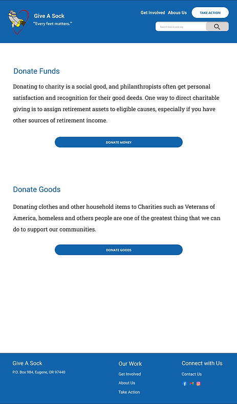
Could you please take us to the screen where you can complete a donation

-
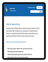
Could you please navigate through the website and find what the company needs and gives
Introduce the purpose of the study
-
Redesign Give a Sock website to make it more accessible and easy from our users to complete a donation.
Secondary Research
In order to understand the pain points that our users encountered when they navigate through the website, we procceded with usuability testing. We used different sources to create a friendly website and make it accessible for everyone who wish to provide support.
Analysis
Interview findings
Our findings were captured from three different users who performed several tasks during the website testing. it helped us to examine how difficult or easy were for them to find information into giveasock.com
“I like the website because it really easy to navigate and It even opens up a bench windows for me, this is dope”
I was wondering if what they do and need is a part of their mission and Vision and mission are pretty underconnect
Interviews Transcripts
When were conducting the interviews, we discorved that many people were interested in donating Funds, Goods, become members and volunteering. When people visited the website the found the layout to be quite confusing and the font was too small to even read without have to zoom in.
“ I would love to redesign give a sock to make it easier for the average person to use the website for donation”
“ When I first encountered the website it was hard for me to figure out the purpose of the website”
Competitor analysis
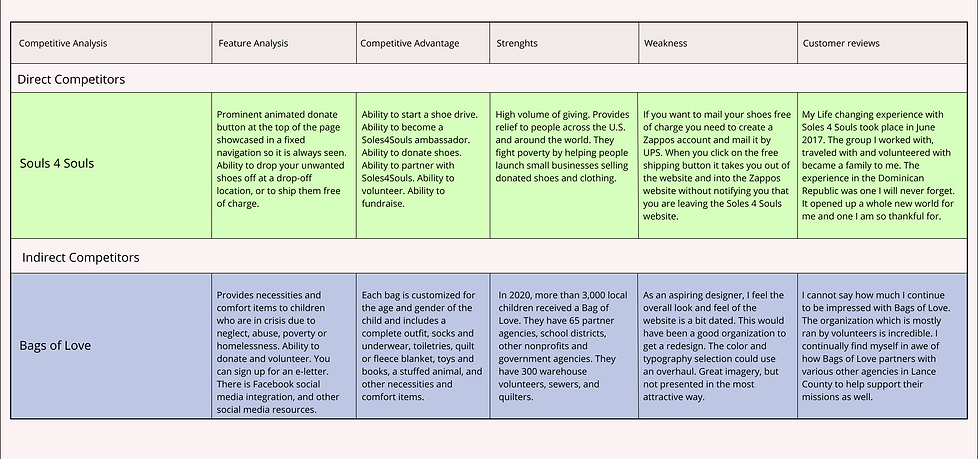
We thought about conducting a competitor analysis in hope to understand our competitors' strengths and weaknesses in comparison to redesign a beautifil platform. We were able to gather key points from the direct and indirect competitors non profit companies which for their missions were to provide helps to needies and charities.
User persona
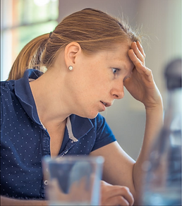
The team and I determined that one of the best way we could start thinking of redesigning the Give a Sock website was to get the deeper understanding of the user's pain points. We created a persona with a character that matched the needs of the users and their expectations.

Problem statement
Many individuals were helping charities to fight diseases and poverty by making donations to different organizations. Give a Sock is one of the charity groups in Eugene that provides help to people across the country. Since then, people were having problems making donations and thinking of the website confused when navigating through it.
How could this website be redesigned so that people can easily explore and accomplish their goals ?
Ideation
Usability outcomes
For the usability testing, we chose adults aged from 18 and above because they are independable and likely to give a donation. After conducting the interviews, The volentueers stated that the website was hard to explore, outdated and had an imperceptible visual design and color theory.
"I can't read if I don't zoom in, when I zoom in the words become really big."
"The website looks outdated, I don't know why there is pictures of the lady, I don't even know who is she."
"It would have be great if the see "Donation" buttom on the header and footer."
Affinity diagram
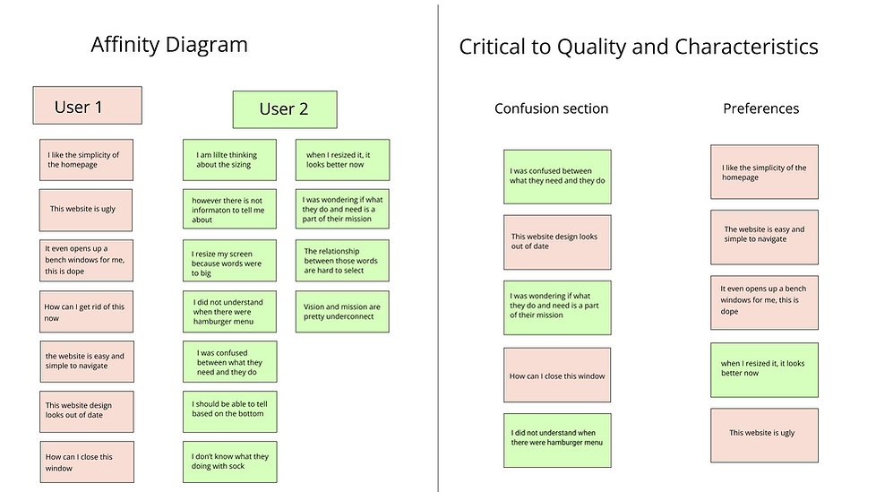
The idea of building an affinity diagram, the critical to quality and characteristcs helped the team to gather key points from the usability testing and have an overview about how the new Give a Sock website will look like.
Prioritization matrix

Challenges & Insights
Before re-organizing the navigation architecture or building a new Sitemap, I personally conducted a usability testing with my taekwondo instructor, He works for an African website that provides support to immigrants. I gathered great feedback which helped a lot whit the redesign process. I informed my teammates later on after the interview and we all agreed to apply those changes.
Below explains why we agreed with the user based on his suggestions.
Me
I thanked the user for joinning the meeting, I introduced myself and talked about the project that we were working on.
I asked the user to walk me through the process of making a donation on the current Give a Sock website
Me
I curiosly asked Why don't you believe that Give a Sock is an accessible website ?
Me
What do you think can be done to improve the accessibility ?
Me
I thanked the user for his feedback and participation
User replied
I can't see the the donation button here! Oh here we go I find it! Oh what's that! Why it is asking me to verifying if not a robot? fhmmmm!.. I don't feel like this website is secured. first of fall the mission of the website does not match the pictures posted on it, and I don't believe if there is no body who has already make donation here.
User replied
Like I just said, the website is unmeaningful, there is not any pictures showing what to donate, I am seeing a woman pictures on the home page, I guess She is the owner! Also the website is called Give a Sock, it means that people can only donate socks?? but why is there a Paypal option to make a payment if I want to donate socks. I don't know, maybe if volunteers donate money, the organization will buy socks with it. Mannh it's just confusing.
User replied
I will say: Re-organized everything, adjust the layout, remove unnecessary pictures, have the mission visible to hit donators atention, change the color , the red color does not look good and maybe add pictures of what people can donate, it can be furnitures, clothes etc... something that will make this website stand as a non profit platform so that everyone will accomplish his mission. Donators will donate funds or goods, and homeless will benefit from it.
Our goal
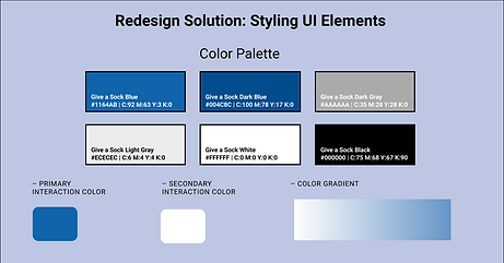
"We worked toward the simplicity of making the website looks convenient and a fun place to refrain. The idea of changing the website color from red to blue and the background from dark to white were captured during the interviews phases when our users were performing tasks. We also decided to add a donation button on the hearder and footer to make it easier for volunteers to make donations."
New Sitemap
After completing the website heuristic evaluation and usability testing the team decided to apply those feedback gathered from a variety of people which directly helped us rebuilding a new sitemap.

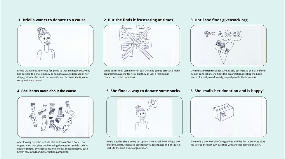
Storyboard
We created a story for an individual who wanted to make donation. Please read carrefully Brielle's steps .
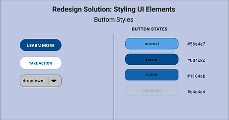
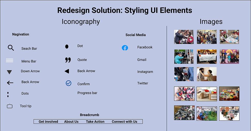
UI style guide


Design
Hi-fi Mobile
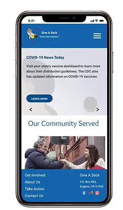
Wireframes Mobile

Wireframes desktop
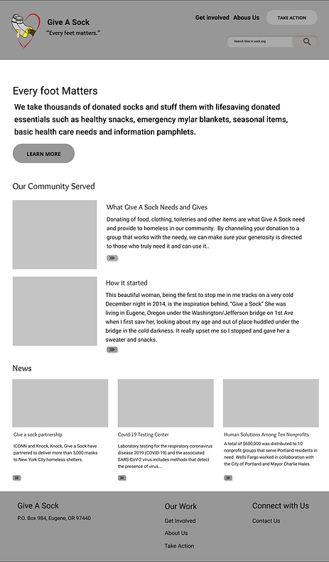

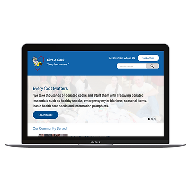
Hi-Fi desktop